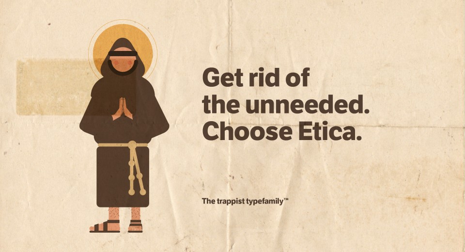
LFT Etica
We love to create new fonts. And she's our favorite.
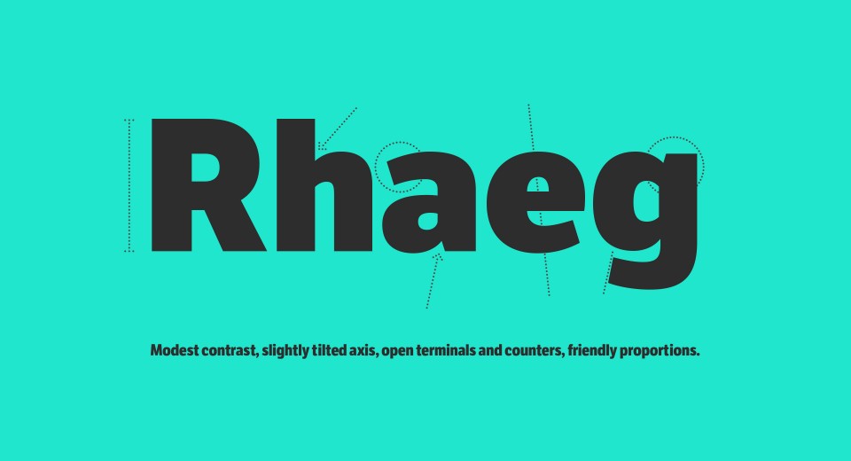
Etica is an ongoing typographic project started in early 2000 and still in development. The idea for this typeface was born – ça va sans dire – as a tribute to Helvetica, but also as a sort of aesthetic manifesto of the studio. Helvetica ruled the world of design for over fifty years: we liked the idea of reinterpreting it, to propose a contemporary alternative to the modernist sans-serif, often used “by default” and in an unaware way.
Buy it from TypeTogether
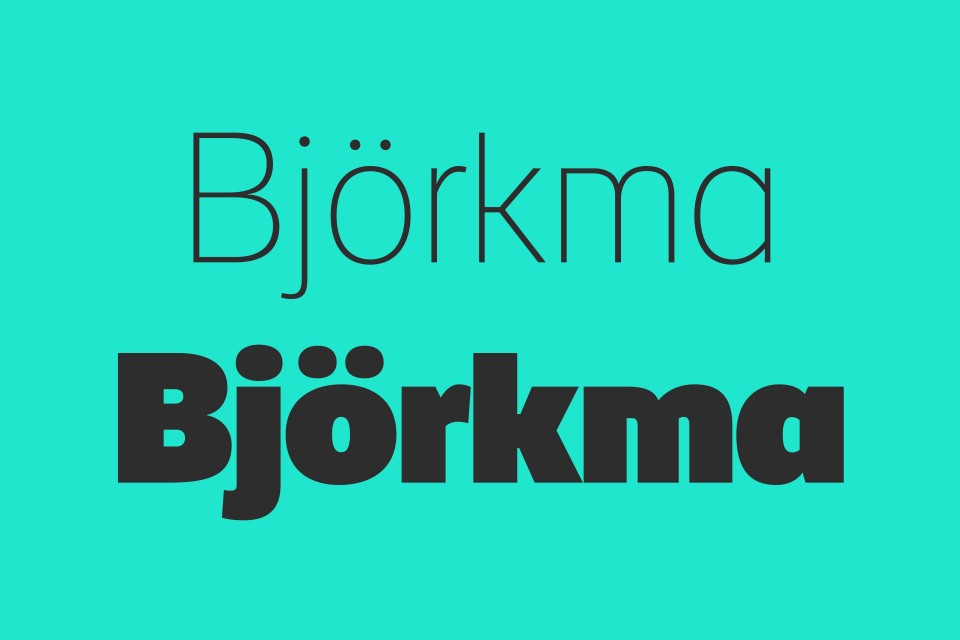
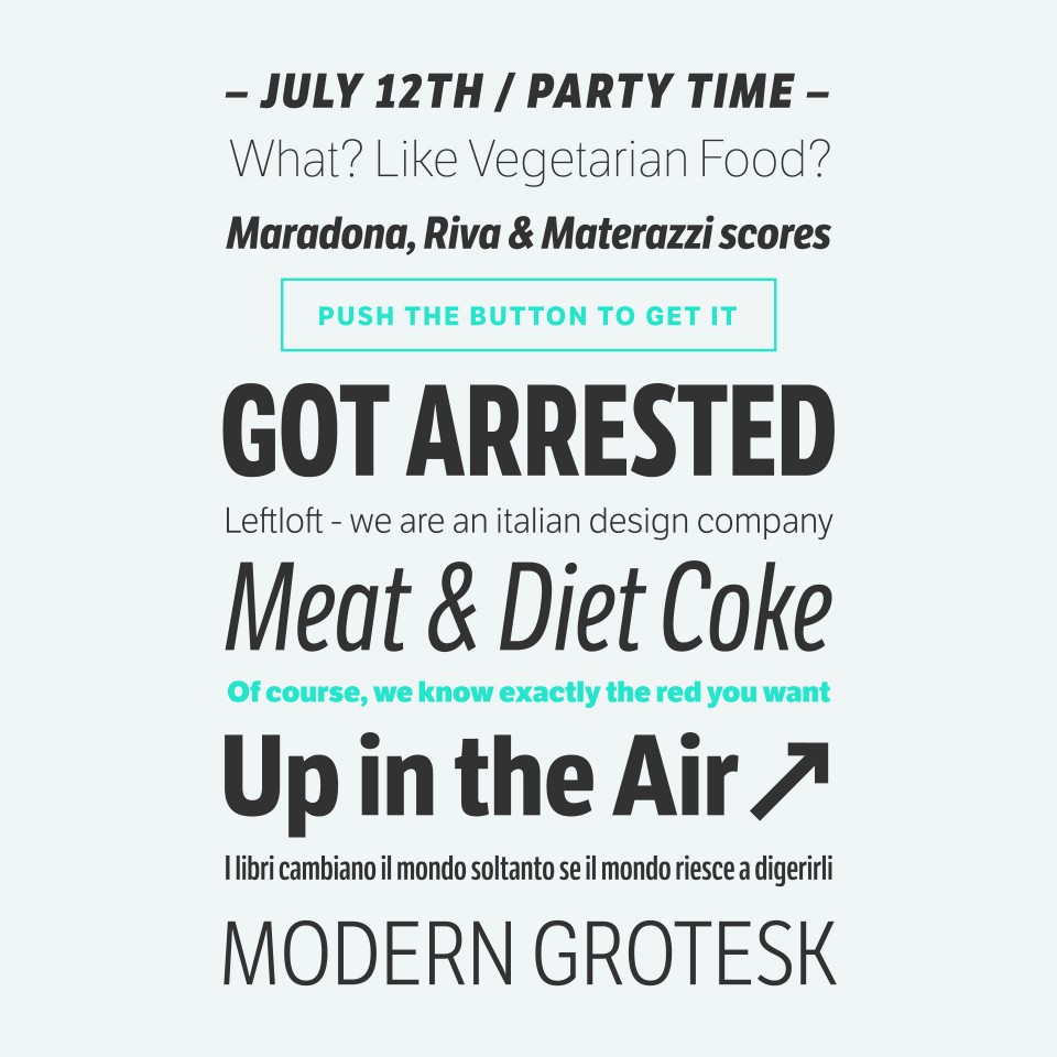
Etica is a cheerful, neat-looking font: the visual impact is that of a grotesque with a humanist sans serif, yet soft strokes, open counters and terminals ensure a delicate, understated elegance.
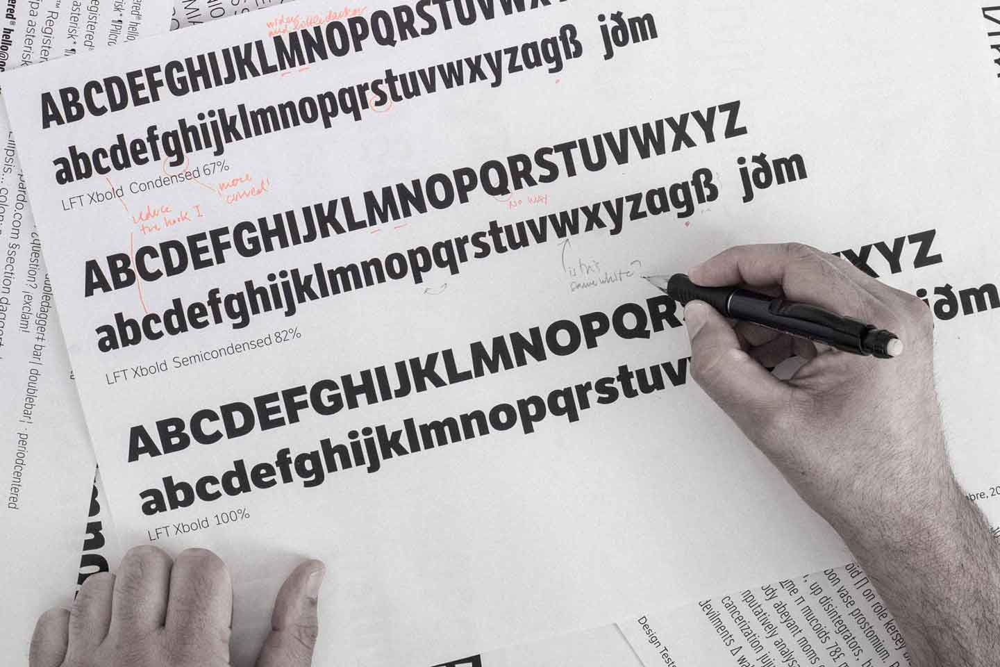
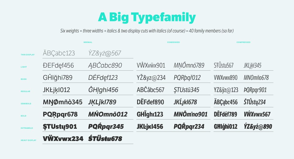
Each letter was studied in detail to ensure durability and adaptability. To meet the demand of different styles and weights, we have recently added another 24 styles, including Condensed and Compressed versions to the family.
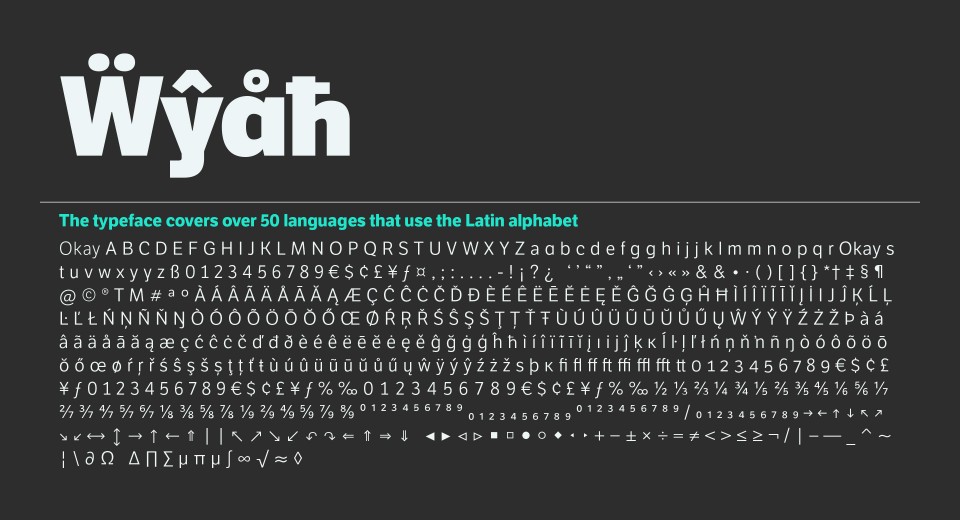
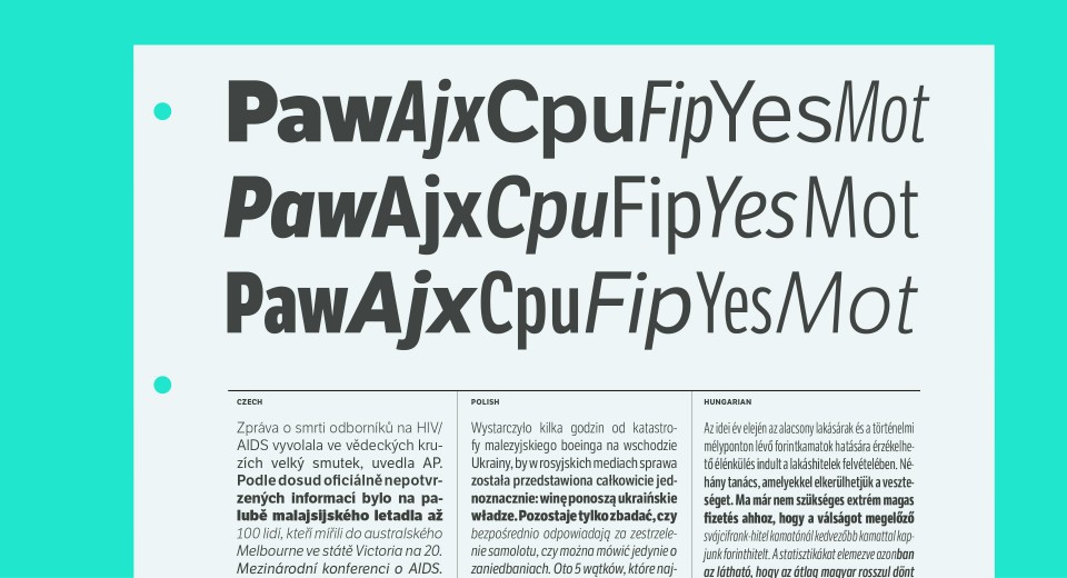
The very first version of Etica appeared at the end of 1999. We kept working on it over the years and since 2009 the font has been on sale on typetogether.com. The current 40 styles, 4 sets of numerals, fractions, arrows and dingbats make Etica a versatile typeface, suitable for corporate or casual use, for publishing as well as web design.
Collections
An overview of our wide fields of action
-
Logos & Trademarks
What makes a brand memorable and unique.
-
Environments & Exhibits
Designing for spaces: from signage to cultural display, from retail to events
-
Art & Culture
We had the chance to work for museums, institutions and organization in Italy and worldwide
-
Educational
Designing for school publishing
-
Type Design
We love typography, we design typefaces, from lettering to complete custom type families.
Case Studies
selected projects
-

BRANDING
Virgin Fibra
Visual identity for a new member of the Virgin family.
-

We are Changing
Arte Fiera 2023
Communication design for Italy’s longest-living modern and contemporary art fair.
-

Curatorship and Exhibition Design
Building the Future for Webuild
Exhibition design and immersive installations at Triennale Design Museum
-

Rebranding
A new brand identity for a historic handle company
From Valli & Valli to Valli