This is Combo
New identity for a brand of hostel, food, drinks, music, art, radio, combined.
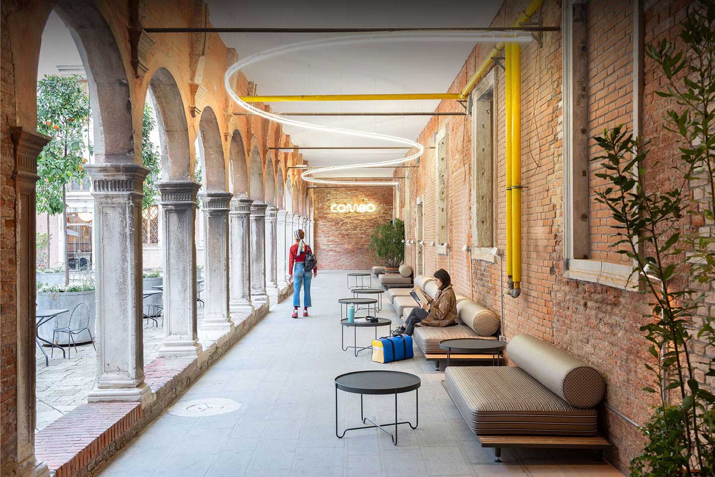
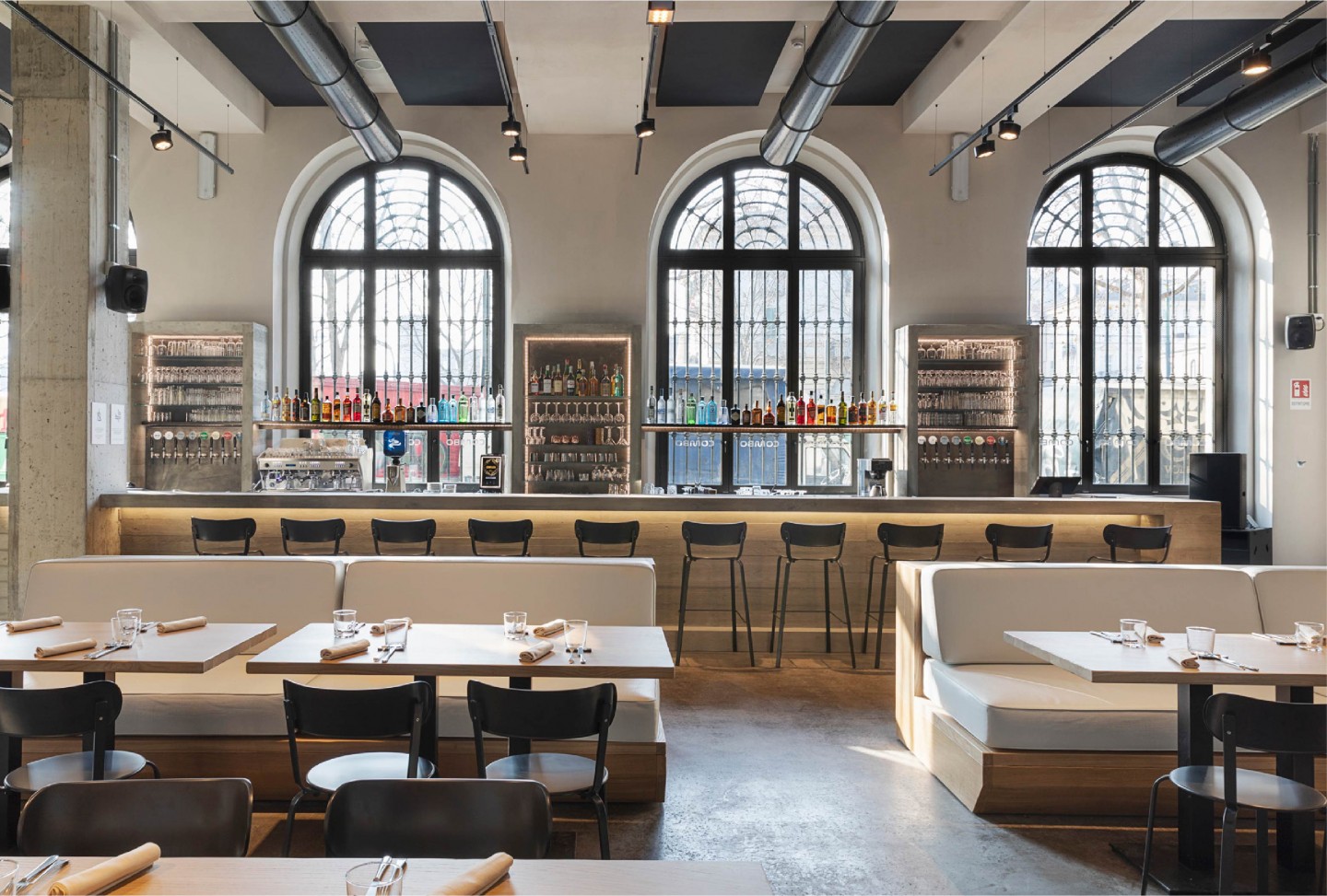
Combo is a new independent Italian chain of hostels opened between Summer and Winter 2019 in Venice, Milan and Turin. It aims to redevelop historic buildings in key Italian cities, transforming them into temporary homes for travellers and locals alike.
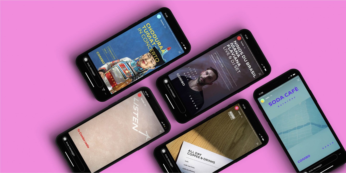
Each Combo hostel is a cultural hub welcoming not only tourists, but also debates, screenings, art exhibits, music shows, and non-profit organizations. Life at Combo is also enriched with a web radio and a calendar of art exhibitions in its venues.
Combo's contemporary and cultural tone of voice speaks to everyone. The mix of "human touch", "playful" and "alternative" language reveals the multiple souls of the brand.
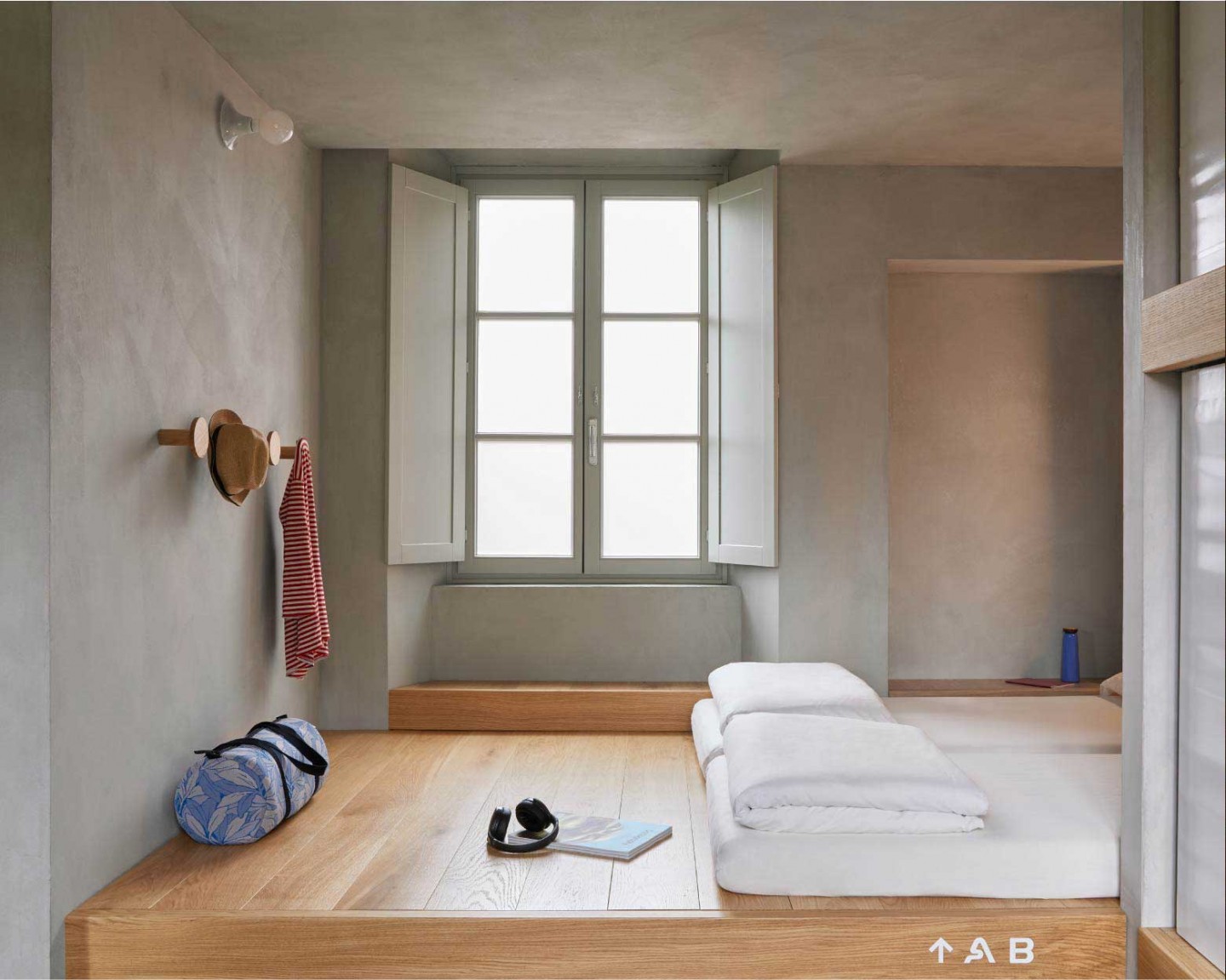

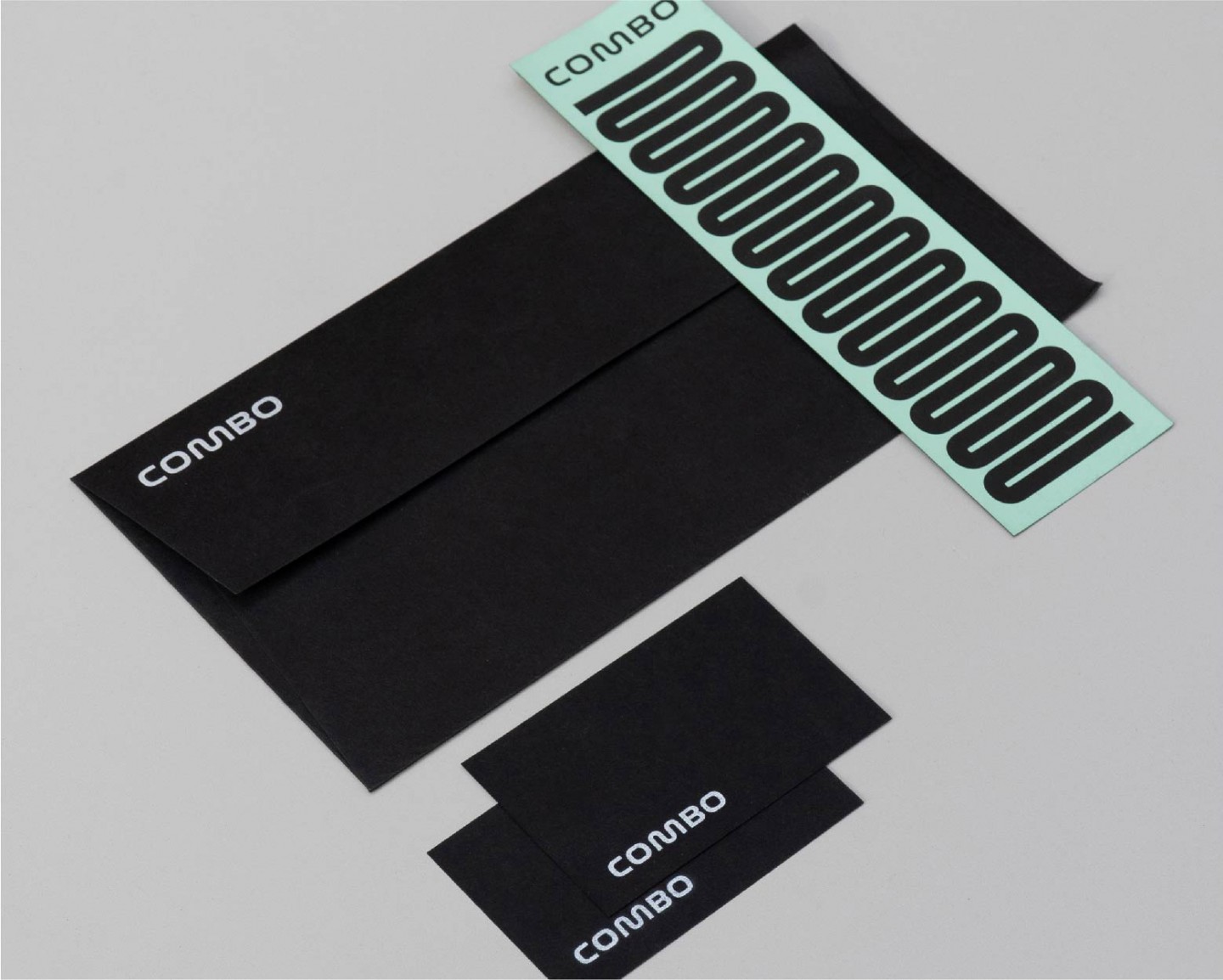
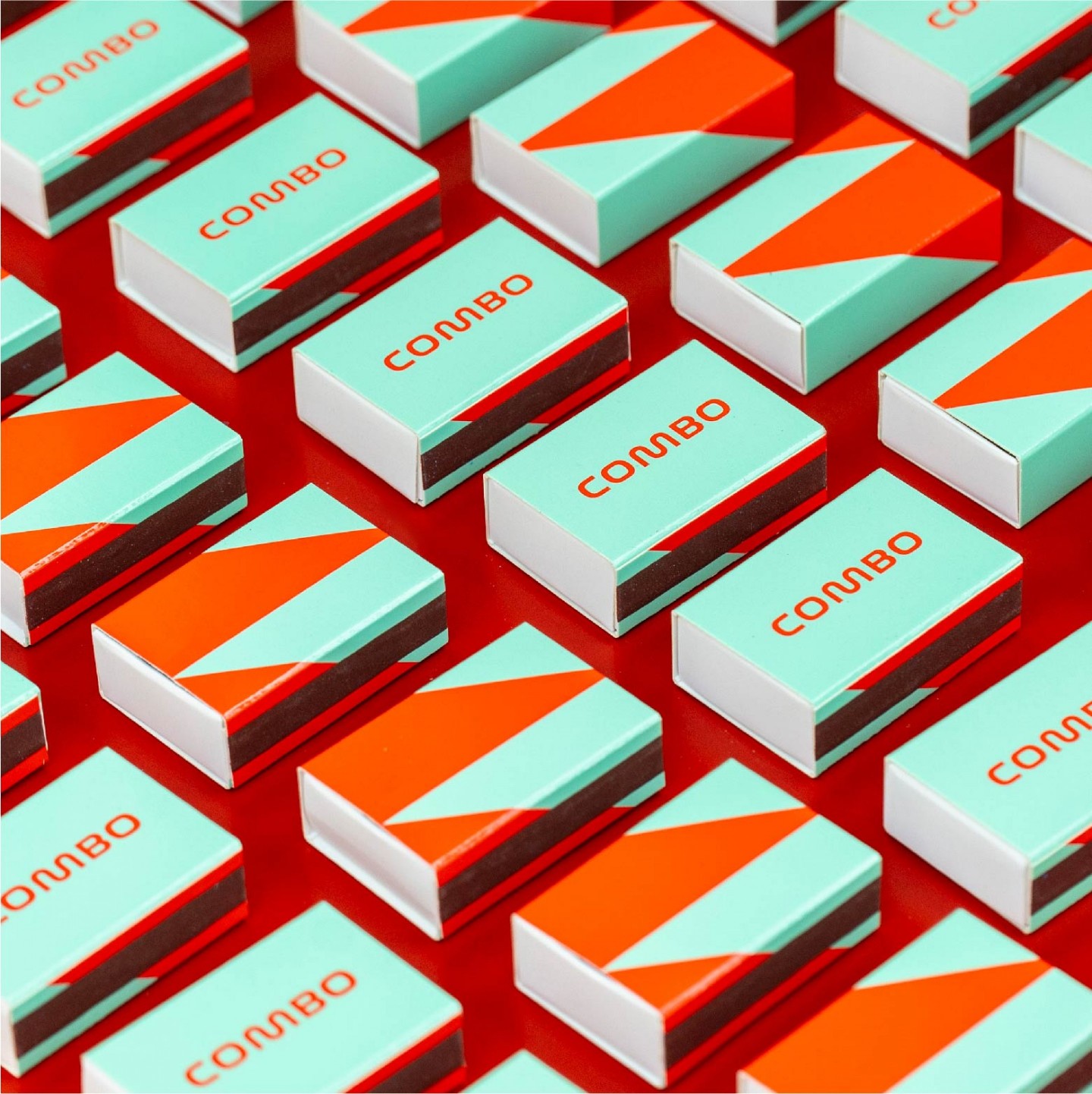
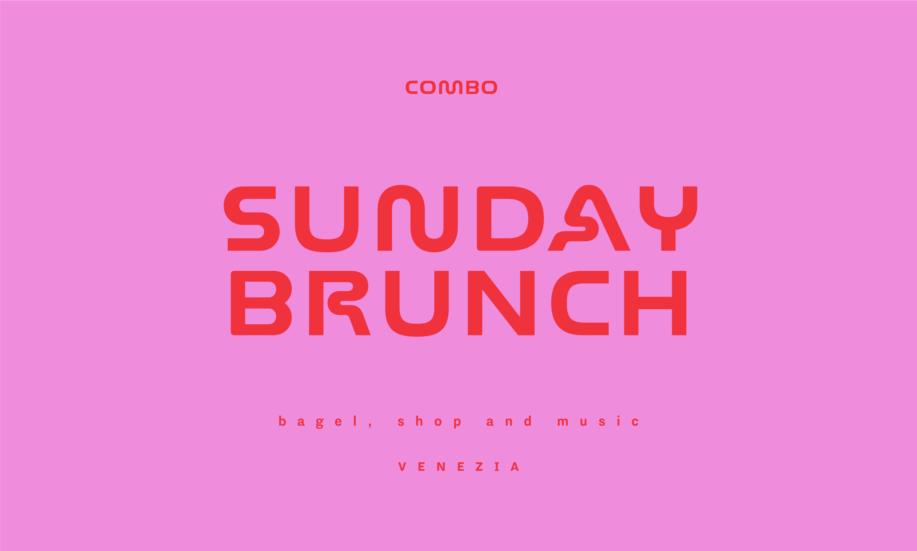
As a counterpoint to the most neutral and welcoming architecture, the identity and all the communication materials have a curious and contemporary look.
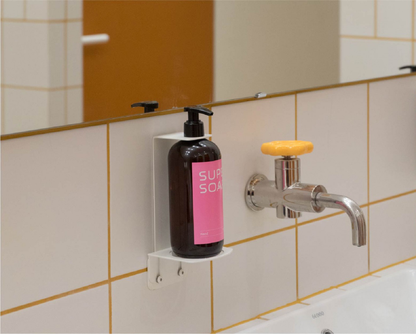
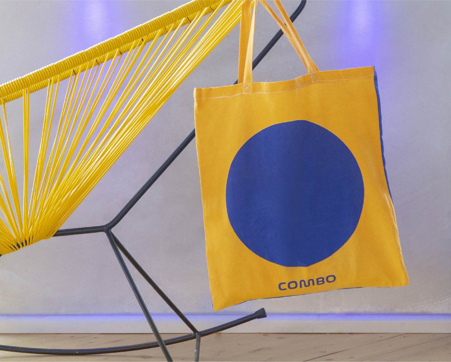
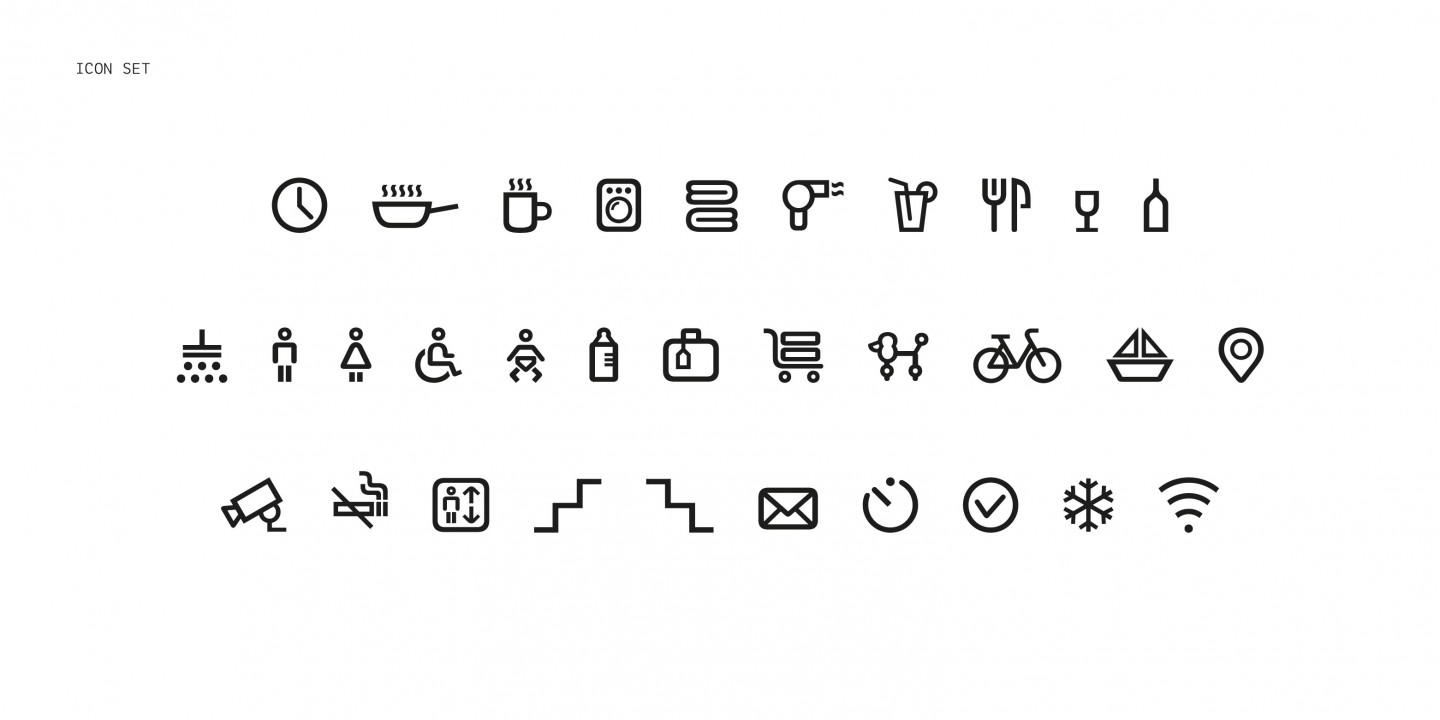
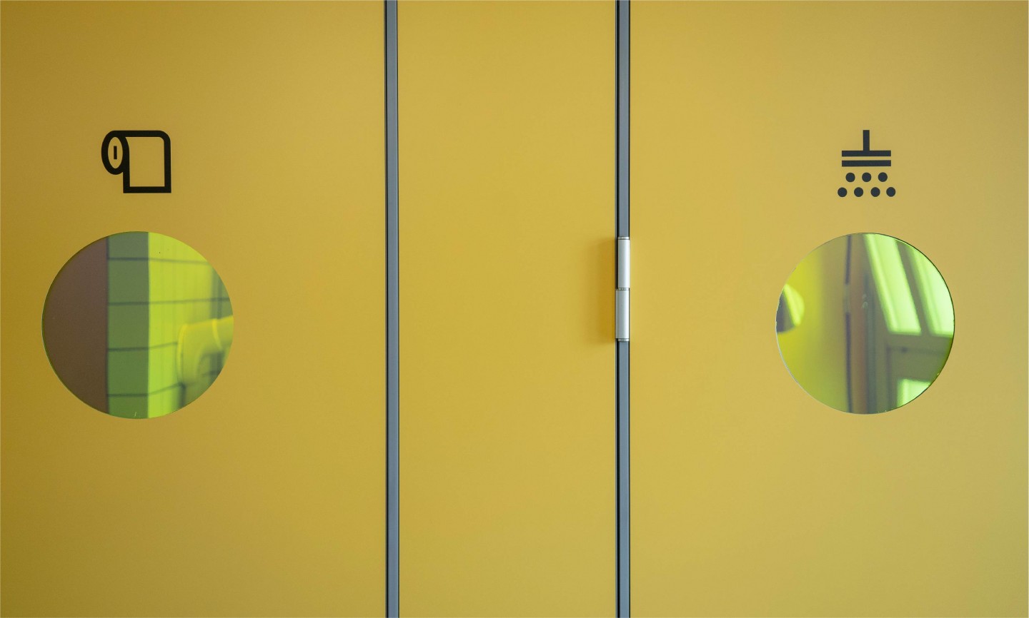
The printed and digital communication system was designed for the launch of the venue and the hostels’ side events as well as the social websites formats for instagram and facebook, the menu, the signs and graphics of the spaces, the merchandising, the website, and the art direction of the photographic images.
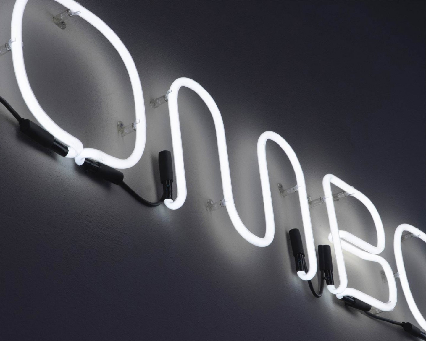
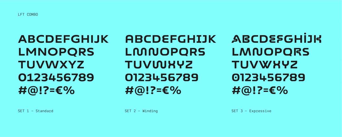
The corporate identity was based on LFT Combo, a custom display typeface reminding of the first video game consoles and with variations of shape in the letter designs. The highly recognizable font is used as the basis of all communication materials both in physical and online spaces accompanied by a palette of strong and contemporary colours.
Branding for a start-up allowed us to deal with all the aspects of the brand taking care of multiple aspects: from the menu at the restaurant to the choice of services that bring the public closer and to influence their perception of the brand.
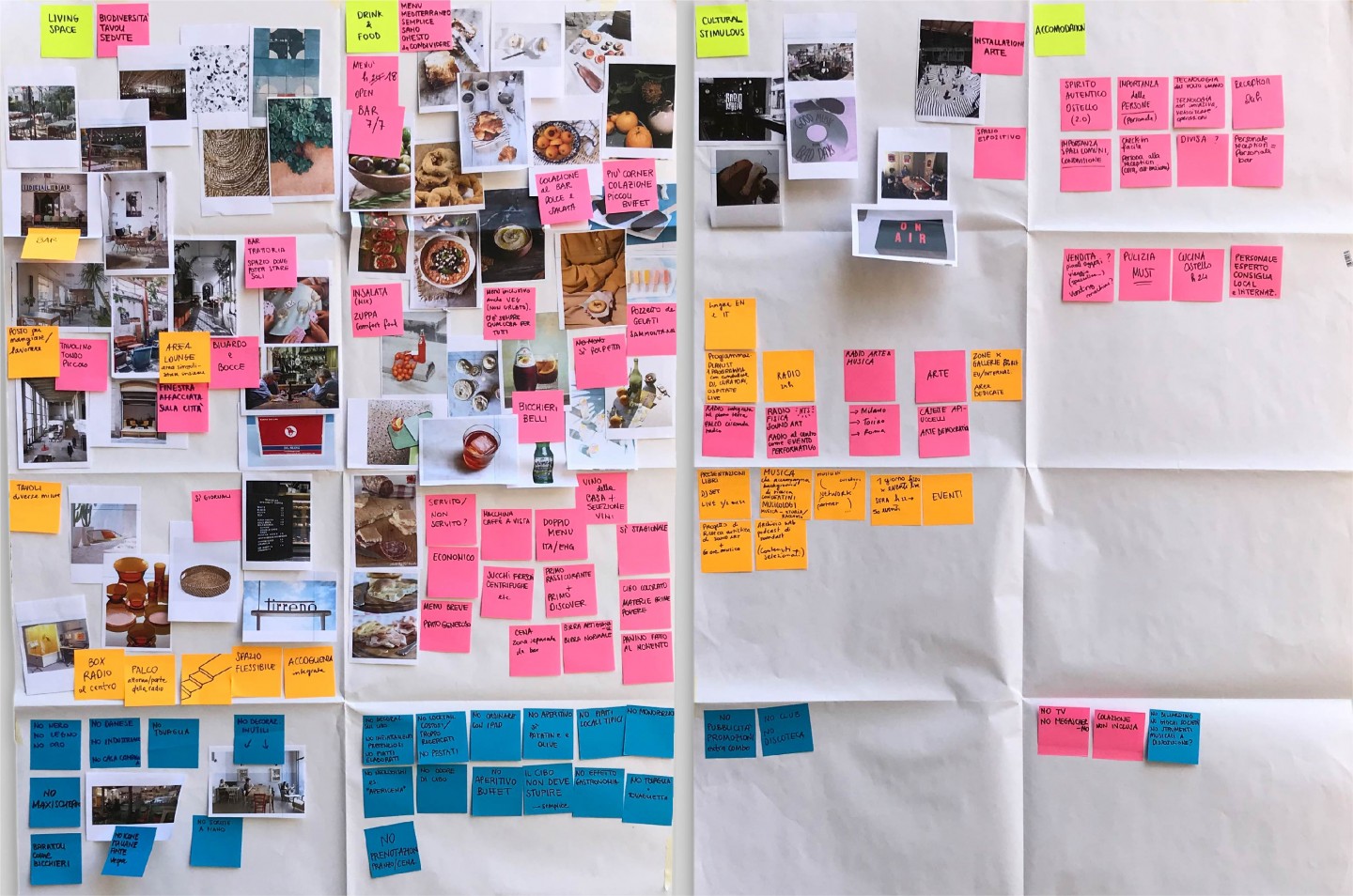
We led the team involved in the project helping them imagine how Combo would look like once opened. We embarked on a "Design Safari" journey, visiting some of the most popular hostel formats in Milan, Copenhagen and Barcelona. We collected hundreds of pictures of the people using those services and getting a more reliable idea of today's customers.

Through a series of co-design meetings and interviews, we have guided the brand towards the definition of its DNA and its offer, starting from the needs and desires of the targeted audience. We built a "Love & Hate" board, that collects recommended and discouraged actions related to the 4 business areas, able to give consistency to the brand identity.
Collections
An overview of our wide fields of action
-
Logos & Trademarks
What makes a brand memorable and unique.
-
Environments & Exhibits
Designing for spaces: from signage to cultural display, from retail to events
-
Art & Culture
We had the chance to work for museums, institutions and organization in Italy and worldwide
-
Educational
Designing for school publishing
-
Type Design
We love typography, we design typefaces, from lettering to complete custom type families.
Case Studies
selected projects
-

Layout, installations, and multimedia content
The Future Unfolds
An immersive and interactive journey to explore the future of mobility
-

exhibition design
125 Volte Fiat
An exhibition celebrates FIAT’s 125th anniversary
-

Campaign Design
Conquistiamo il nostro spazio
OOH campaign and website on shared public spaces and active mobility in Milan.
-

Event Design
Inspiring Cities
COIMA 50th Anniversary Event